Fern Fields Case Study
Part 1
Ferns Fields is a nature-themed design font. The objective was to have this font styled around Western North Carolina and its nature, while also mimicking the style of Scandinavian/Nordic design characteristics.


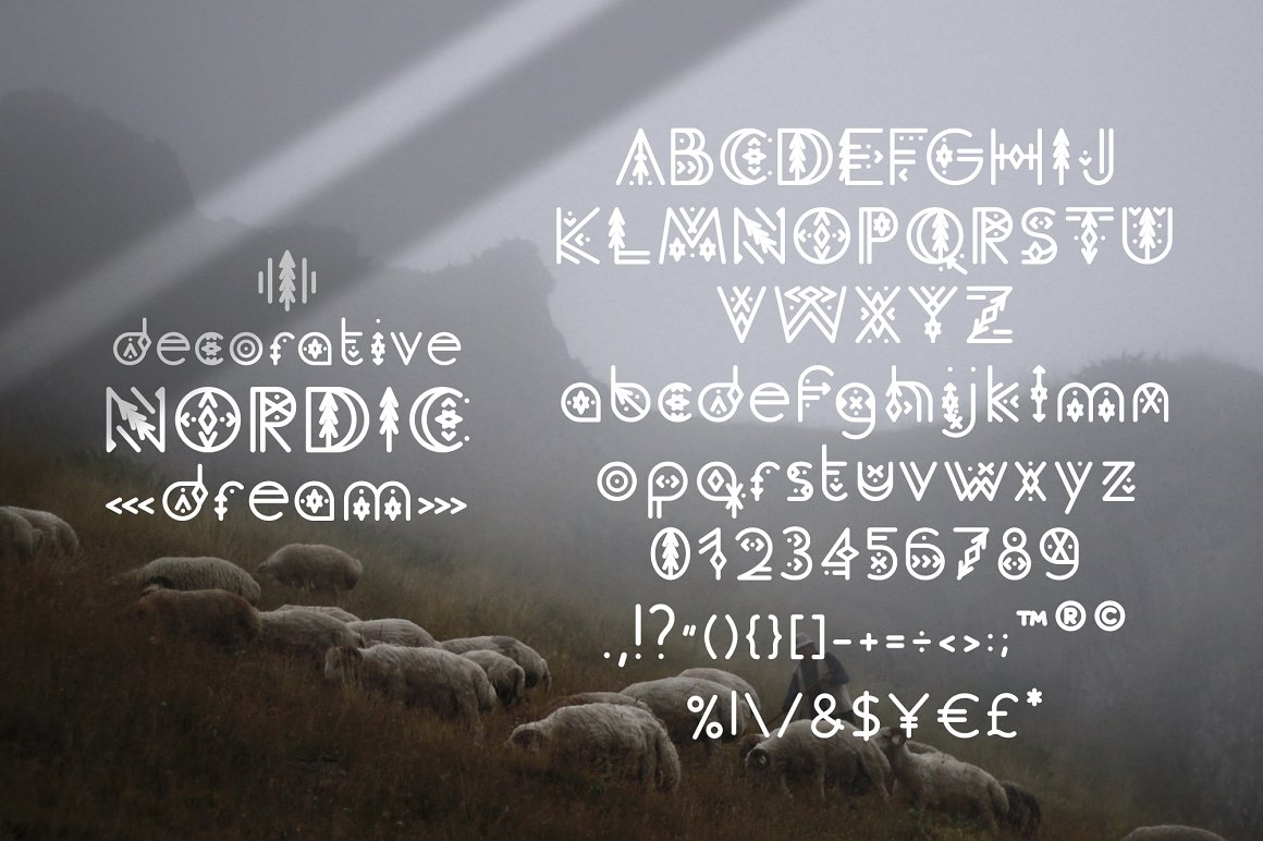
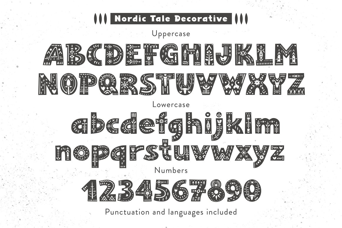
In my research, I looked at many different types of decorative fonts such as the ones above. Looking at the characteristic of this style, something I noticed was; thick fonts with symbols within and slim fonts with extra symbols such as dots or lines, sometimes other objects such as trees. Sources to these fonts are Nordic Tale Decorative
In addition to this, I began researching the flora and fauna of Western North Carolina to use for my designs.
Some animals that reside in that area include; Black Bears, White-Tailed Deer, River Otters, Beavers, Bobcats, Coyotes.
Some plants that reside in that area include: Loblolly Pine, Red Maple, Oak Genus, Yellow Popular, Sweetgum, Hickory Genus, Leyland Cypress, Bradform Pear, Crepe Myrtle, River Birch, Magnolia, American Beech
Part 2

Using the Research and Inspiration I collected, I then attempted to create the font with the desired theme.
For one, I attempted the more slim design with the added detail on the sides, in this one I decided to add ferns to the letters as well as curved lines to emphasize the hills in Western NC.
For the other, I went with the thicker letter with the symbols within them, trying to add the flora and fauna that I researched.
Part 3

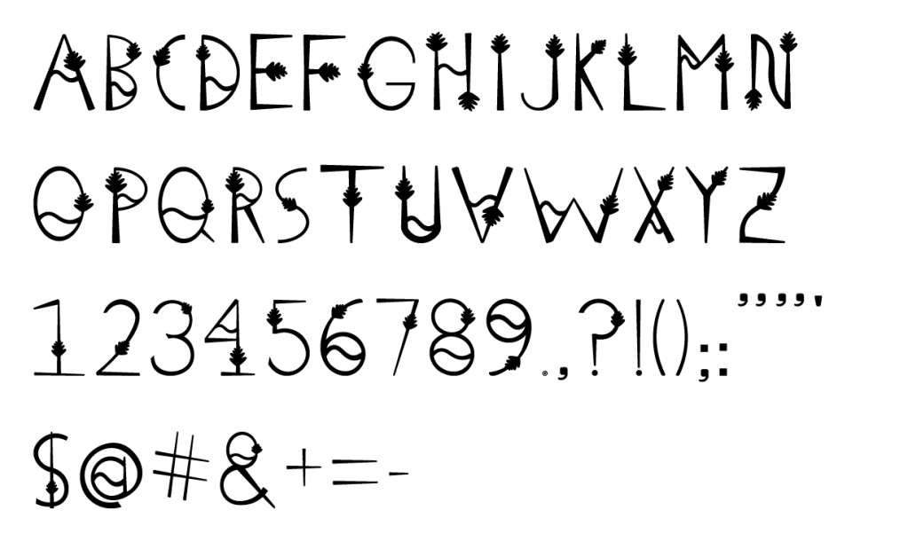
Choosing the first more slim design, I decided to recreate them digitally and add all the letters, numbers, and symbols that had not yet been created. With each one I attempted to add the fern and curved line, leaving them out when it seemed appropriate.
Part 4

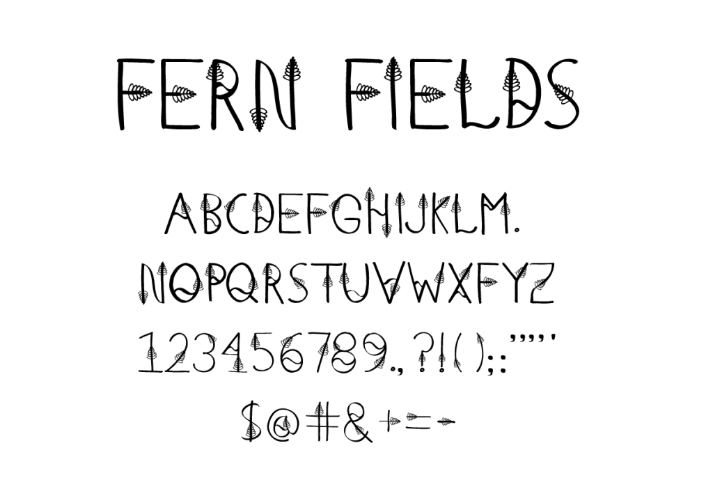
Going over the design one more time to refine it, I decided I wanted to make the lines within the font a little less uniform. So I decide to use the brush tool within Illustrator to give the font a little bit of an imperfect, hand-drawn feel. I also added more ferns to many symbols that I did not add to in my first attempt, adding more cohesiveness to the overall design.
Part 5


And finally using the font I had created, I implemented them into mockups, showing how they would be used. Here we have a post advertising a trail within British Columbia. And next is a t-shirt design called “Continue to Grow”
